US Health Testing – UX Overhaul for a Nationwide Lab Booking Platform
Project Overview
Client
US Health Testing – Nationwide drug, alcohol, and employment-related lab testing
Role
Lead Product Designer, Independent Consultant
Deliverables
End-to-end UX redesign, visual design, and design system
Impact
Validated 30-40% improvements in user retention, booking speed, and support reduction through usability testing
The Challenge
US Health Testing enables individuals, employers, and legal authorities to book certified lab tests online and visit nearby clinics nationwide.
Critical Issues Identified
- Outdated and visually untrustworthy interface that failed to inspire confidence
- Fragmented experience with confusing navigation across multiple pages
- Unclear guidance on test panel selection (5-panel vs 10-panel, etc.)
- Checkout process spread across multiple slow-loading screens
- Created unnecessary anxiety during already stressful situations
Goal: Redesign the entire booking journey from discovery to confirmation.
My Role & Approach
- UX Strategy: Information architecture and user journey mapping
- Visual Design: High-fidelity UI design for desktop and mobile
- Design Systems: Created scalable component library
- Independent Execution: Worked as consultant, closely aligned with business goals
Delivered structured, scalable solutions for a nationwide user base across healthcare, legal, and employment contexts.
Research & Discovery
User Journey Analysis
Mapped critical user paths to identify friction points and optimization opportunities across the booking experience.
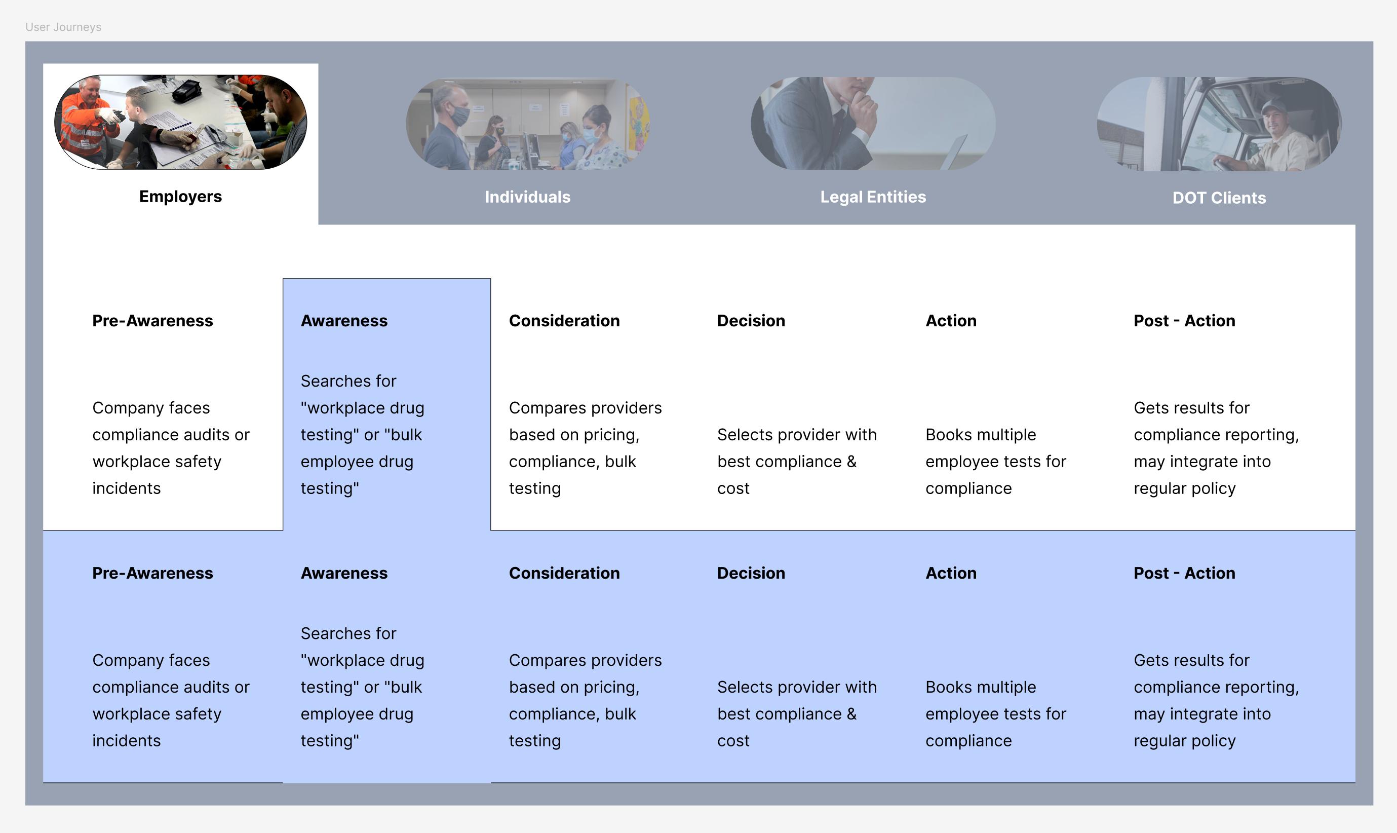
Identified critical drop-off points during test selection, location finding, and checkout processes. This analysis revealed where users experienced confusion and anxiety, informing our redesign priorities.
Persona & Needs Assessment
Analyzed diverse user types and their specific requirements when booking lab tests for different contexts.
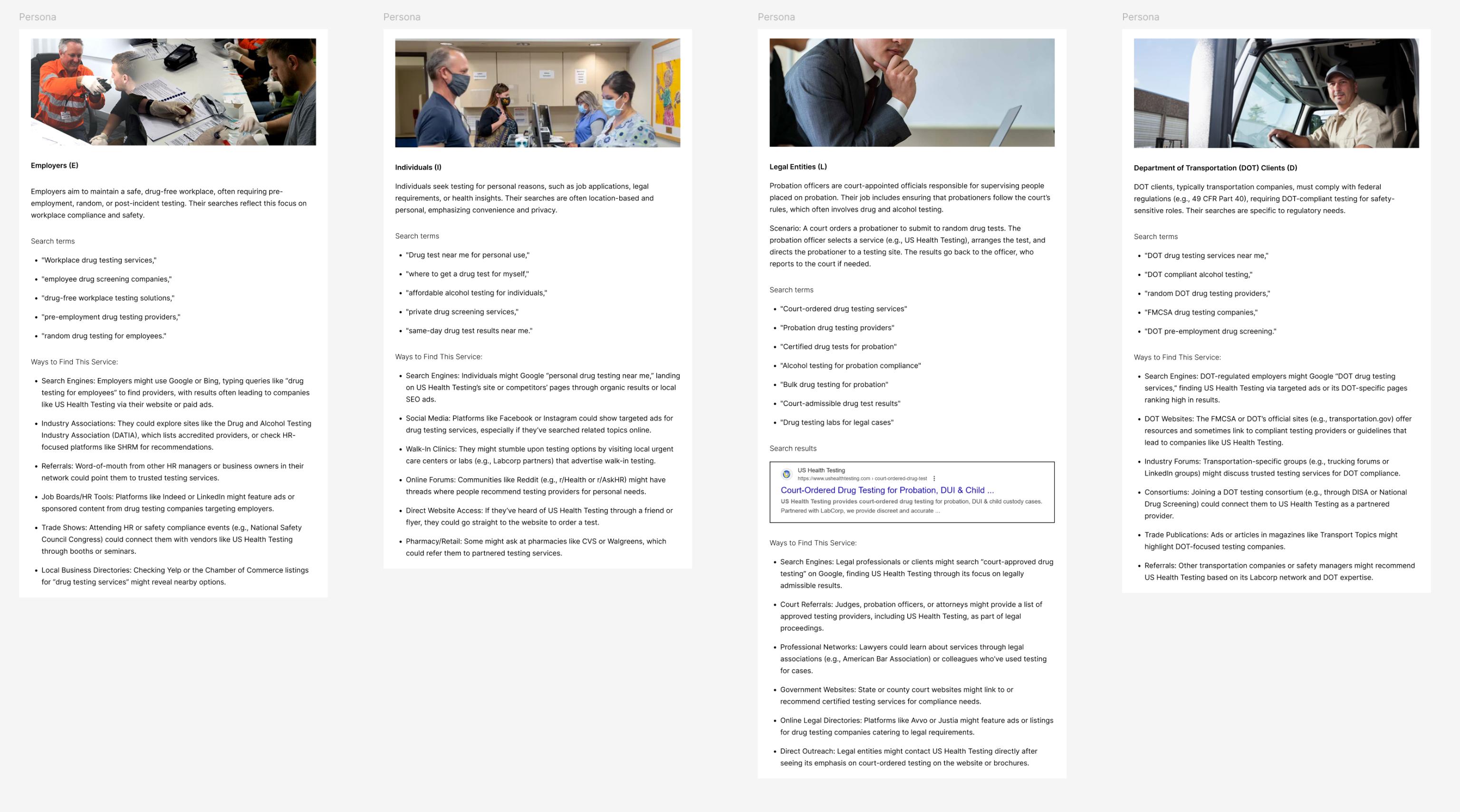
Defined key user segments (individuals, employers, court-ordered, DOT compliance) and their unique pain points, motivations, and success criteria. This research directly shaped our navigation structure and content prioritization.
Key Insight: Different user types needed distinct pathways but shared common anxiety around test accuracy and clinic accessibility.
Comprehensive Redesign Overview
The main challenge was reducing complexity and information overload while maintaining SEO performance and search visibility for critical healthcare terms.
The Problem: Users were overwhelmed by dense information, confusing navigation, and multiple competing calls-to-action that created decision paralysis.
The Solution: Restructured information hierarchy, simplified user paths, and maintained comprehensive content for SEO while presenting it in digestible, progressive disclosure patterns.
Testing Result: Validated 30% improvement in user retention while preserving organic search rankings for critical healthcare testing keywords.
Key Design Solutions
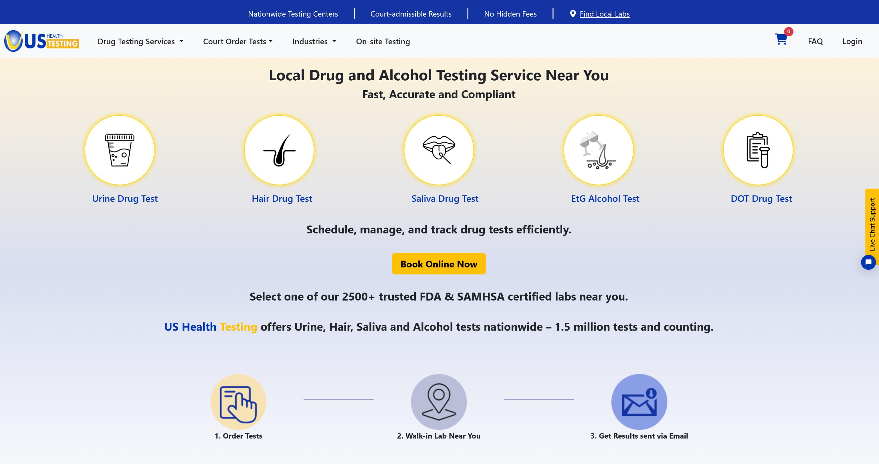
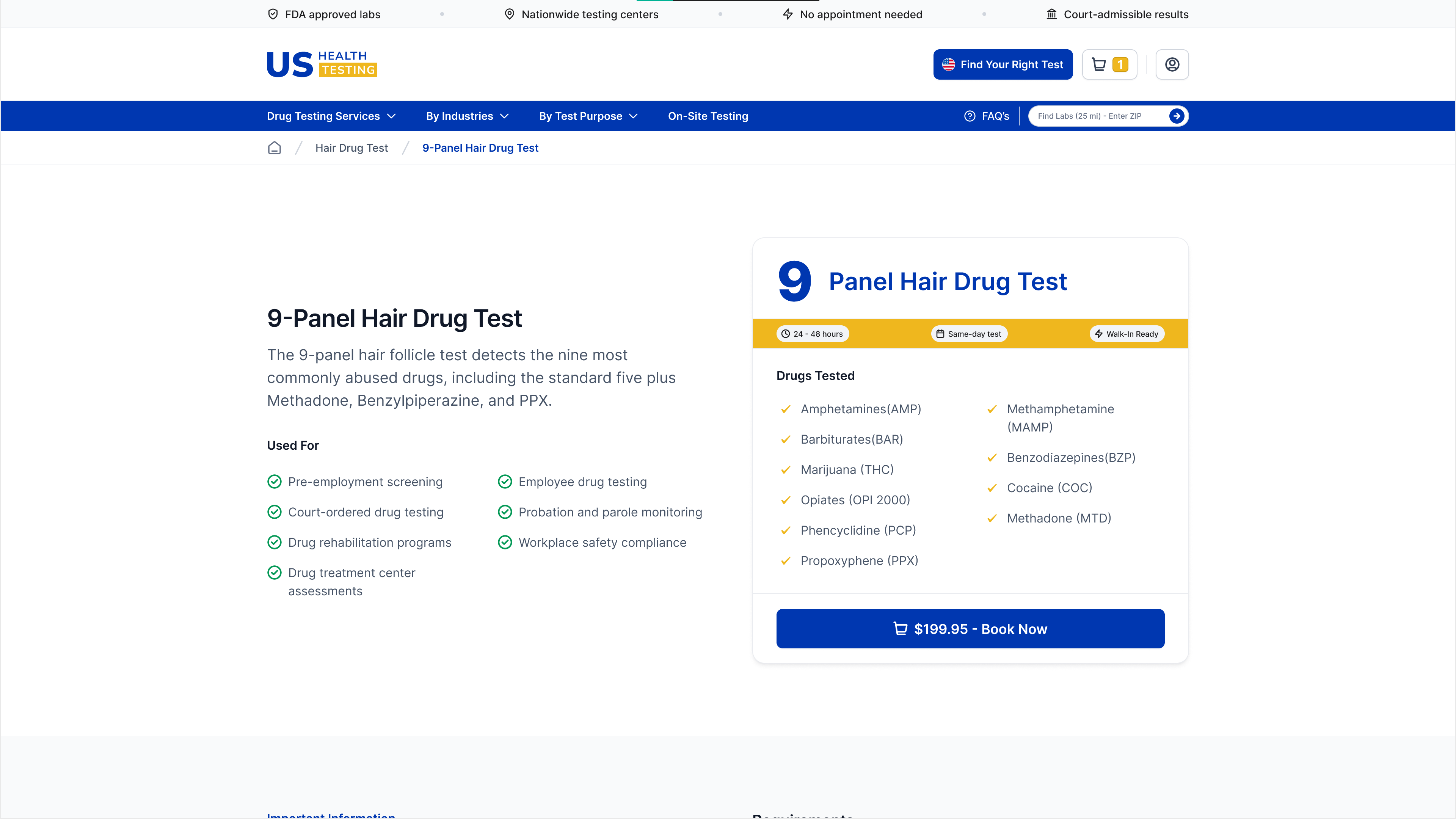
1. Complete Interface Transformation
Redesigned the entire user interface to eliminate information overload while maintaining comprehensive test information.
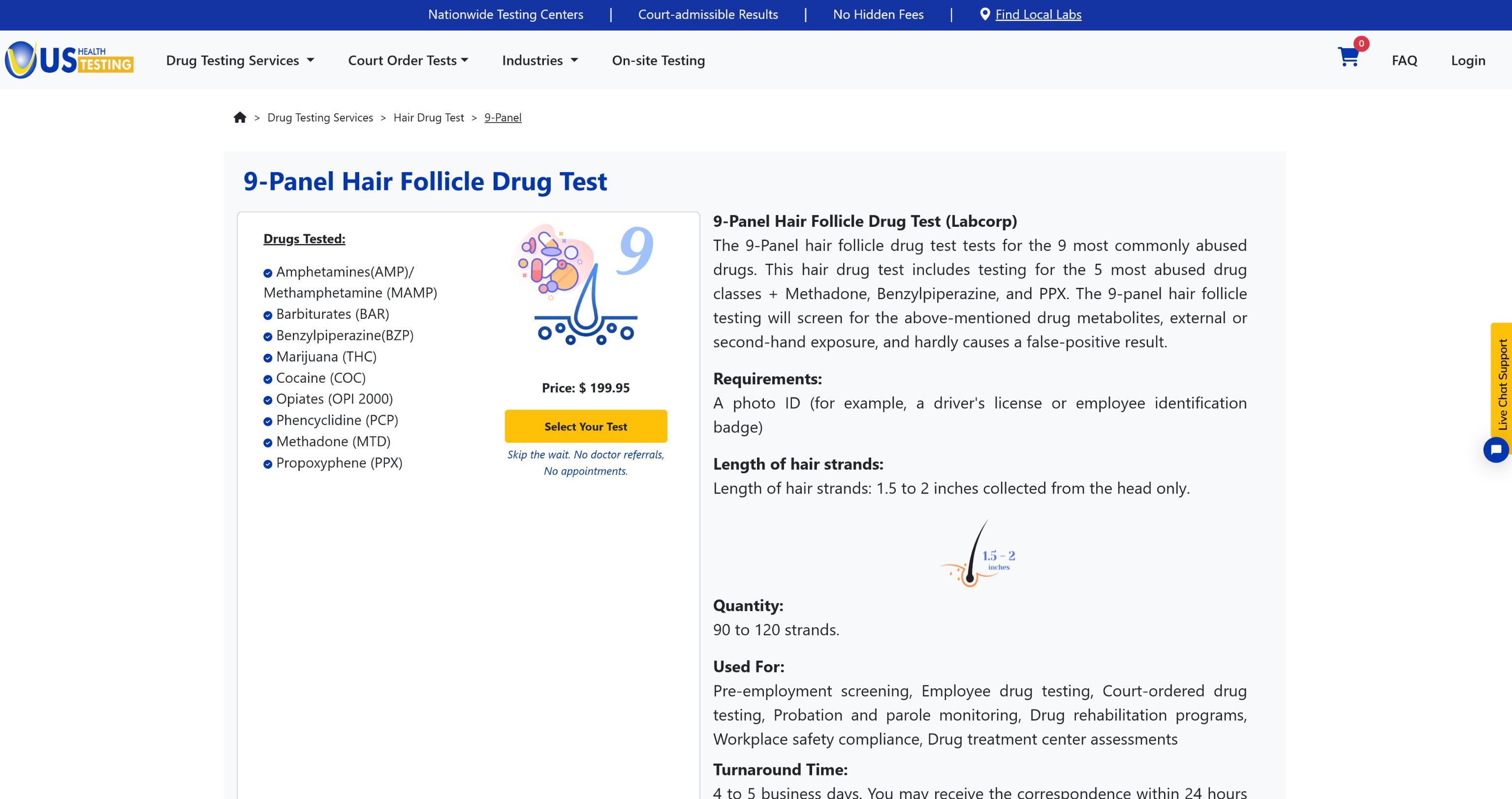
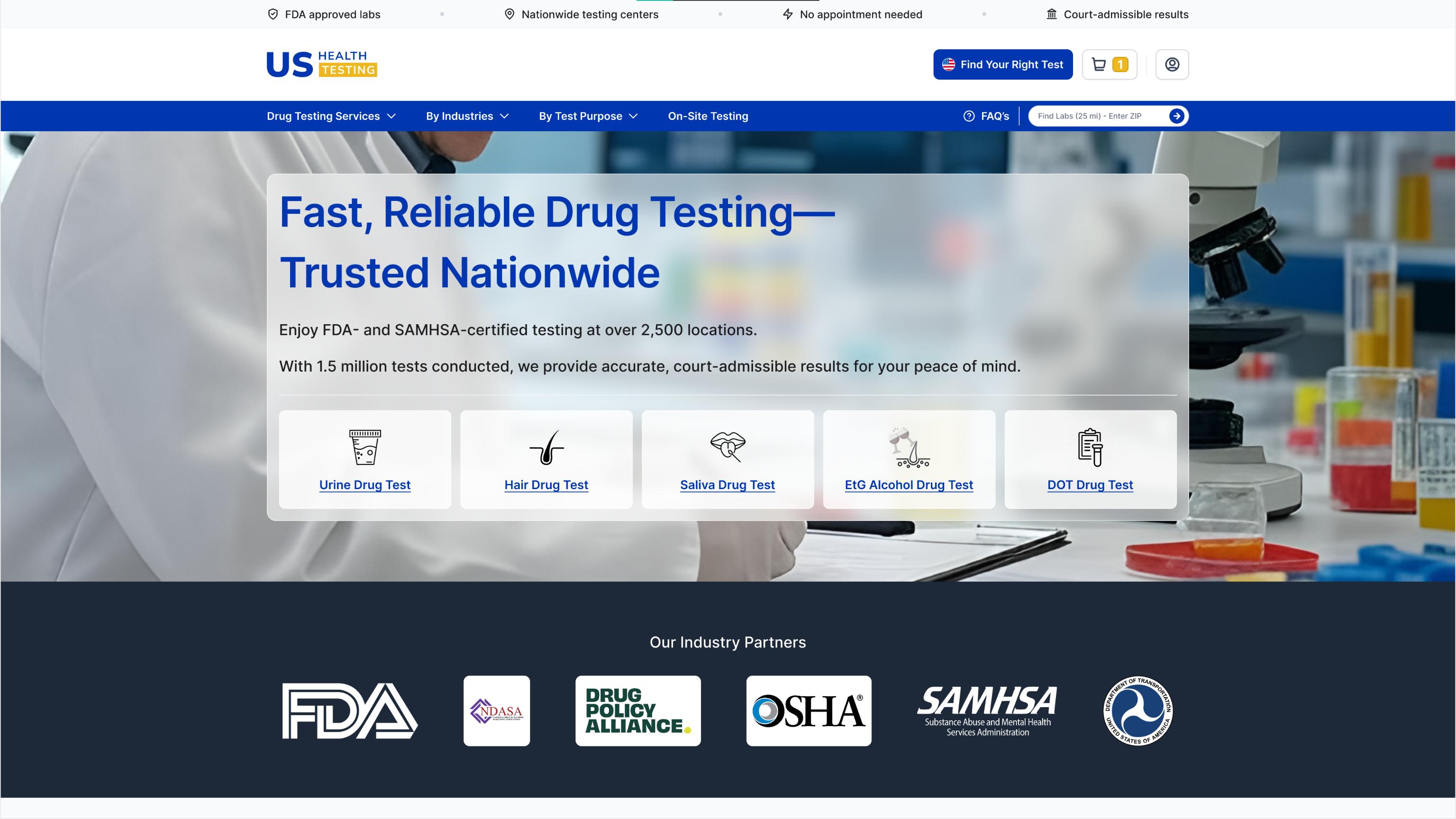
Before: Dense, overwhelming layout with competing elements and poor visual hierarchy
After: Clean, organized interface with clear user paths and focused content sections
Testing Result: Usability testing confirmed dramatic reduction in cognitive friction, with users reporting 8/10 clarity rating vs. 3/10 for previous design
2. Navigation Restructure
Transformed dozens of confusing menu items into clear, intent-based categories.
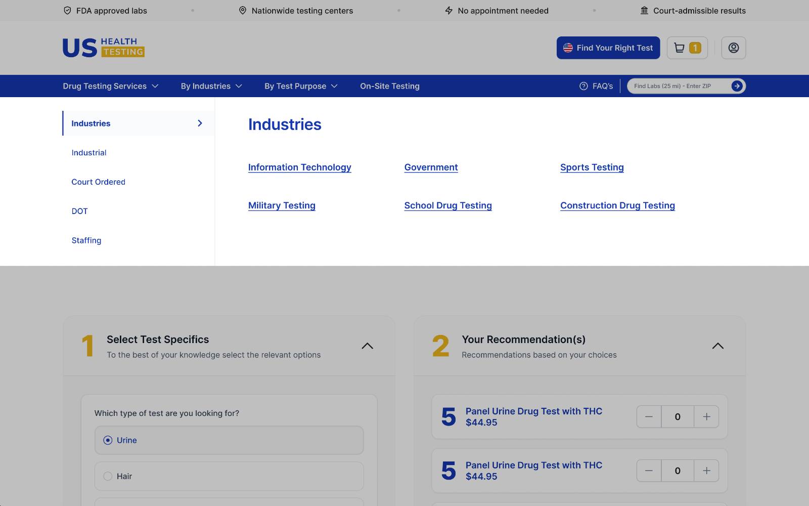
Before: Flat structure with redundant categories scattered across pages
After: Organized by user type (Individual, Employer, Court, DOT) with optimized mobile experience
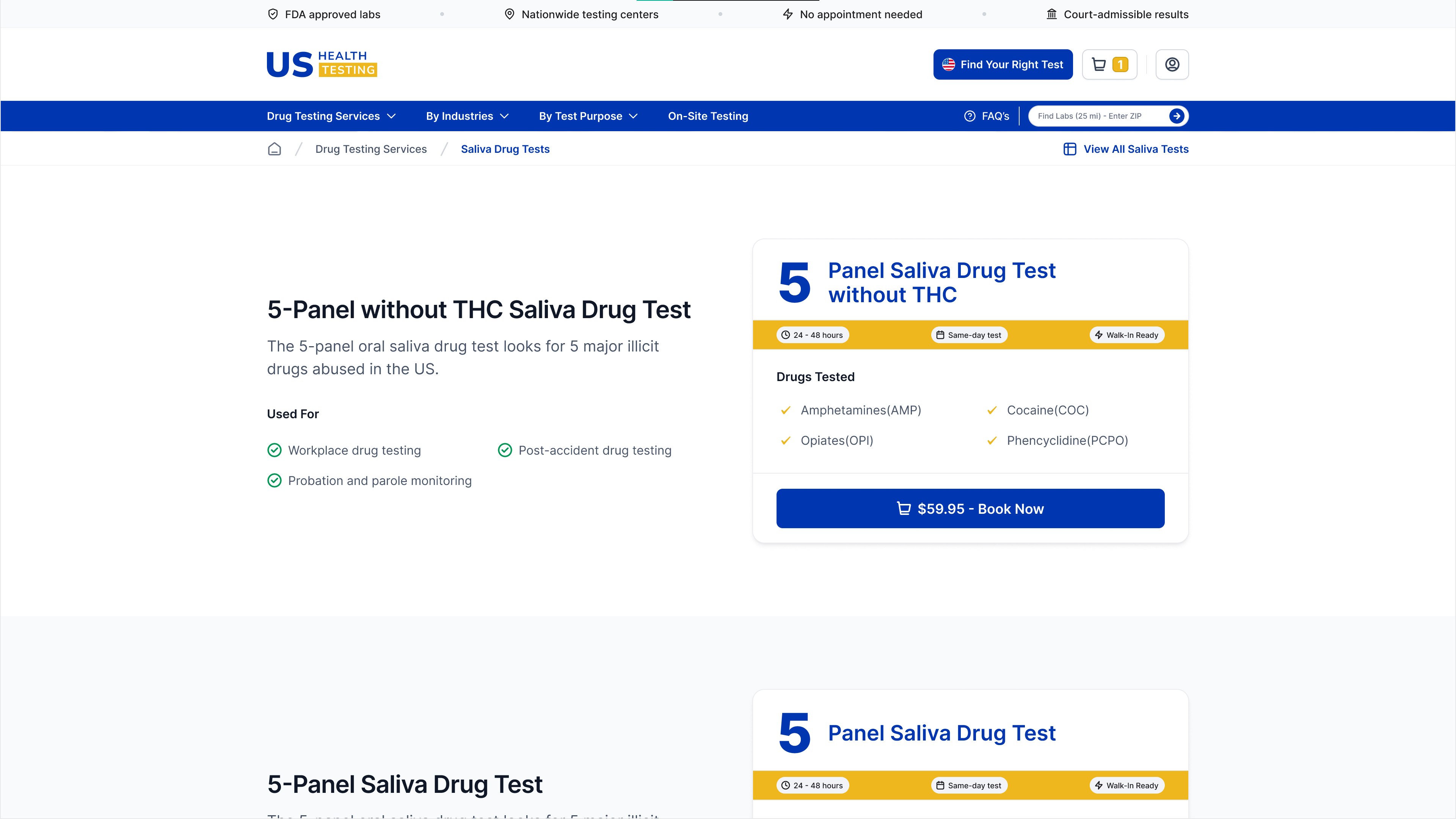
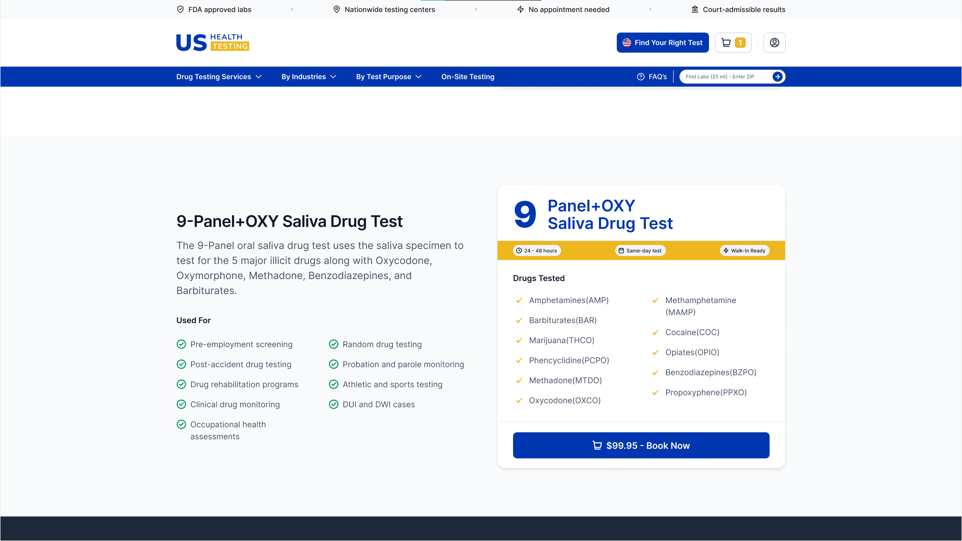
3. Guided Test Selection
Eliminated confusion around test panel selection with an intelligent recommendation system.
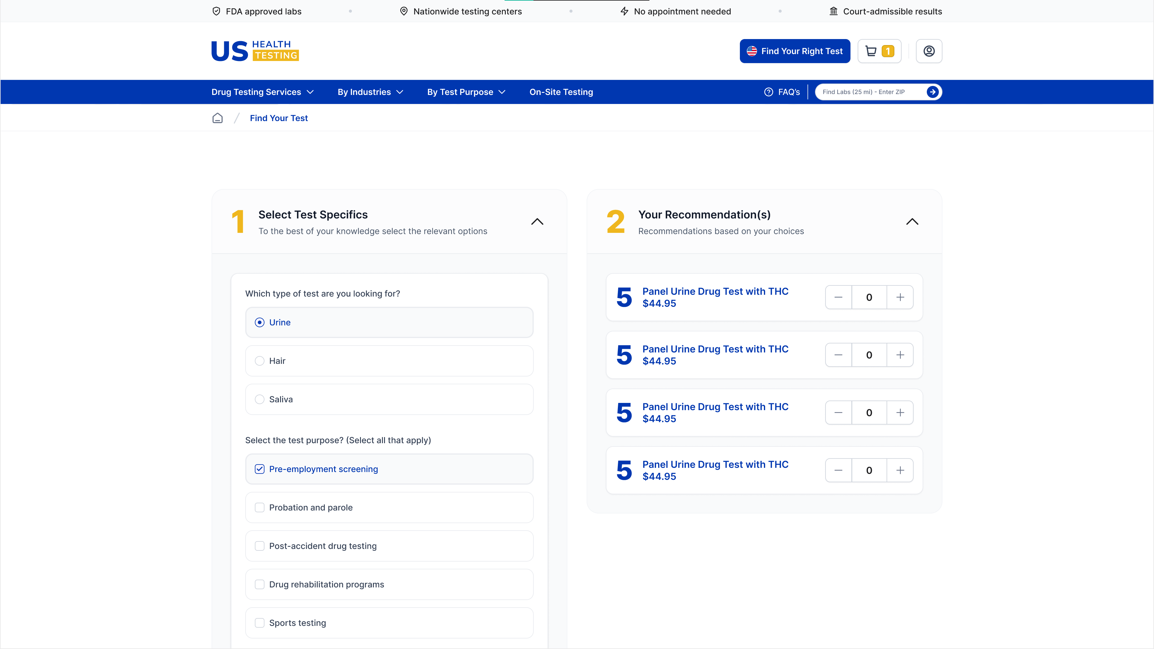
The Problem: Users couldn’t differentiate between 5-panel, 10-panel, and other test types
The Solution:
- Users answer 2-4 plain-language questions about their situation
- System recommends the most appropriate test
- Clear labels like “Court Recommended” or “Employer Standard” provide context
Testing Result: Validated 40% reduction in user confusion, with 85% successfully selecting correct test independently in usability sessions
4. Streamlined Checkout
Consolidated a confusing multi-step process into a single, intuitive checkout experience.
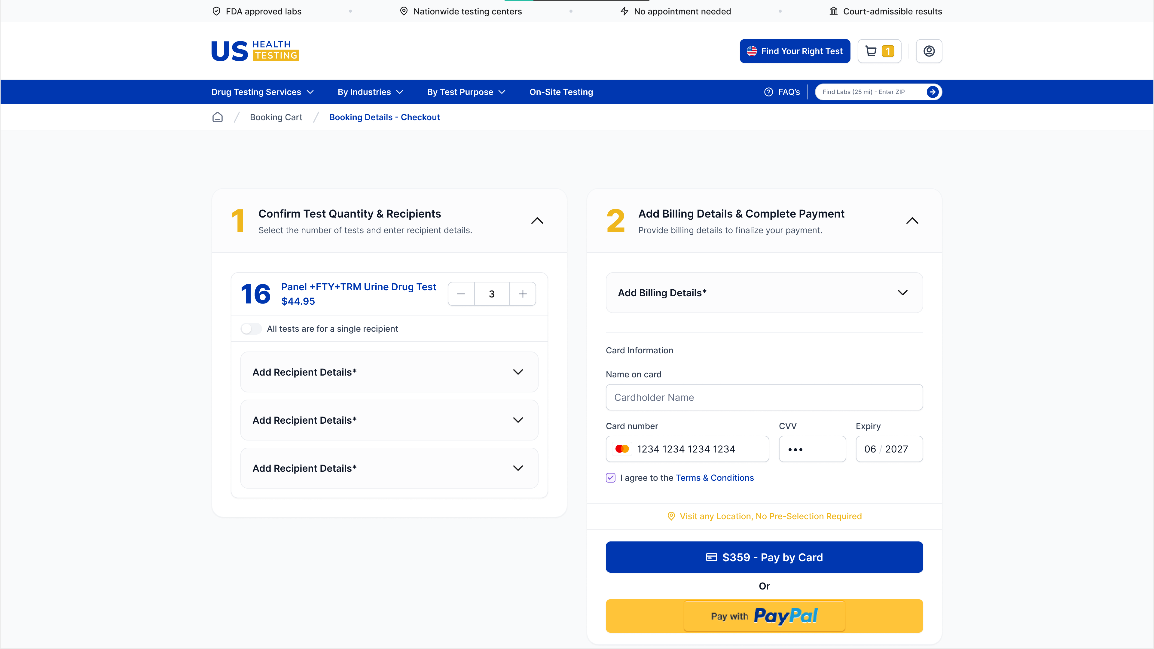
Before: 5+ reload-heavy steps spread across multiple pages
After: Single-screen checkout with inline steps and smooth transitions
Key Improvements:
- Smart defaults and pre-filled fields reduce friction
- Mobile-first responsive layout
- Clear validation, error handling, and progress indicators
5. Location-Based Lab Finder
Simplified the process of finding nearby testing locations with an intuitive zip code search.
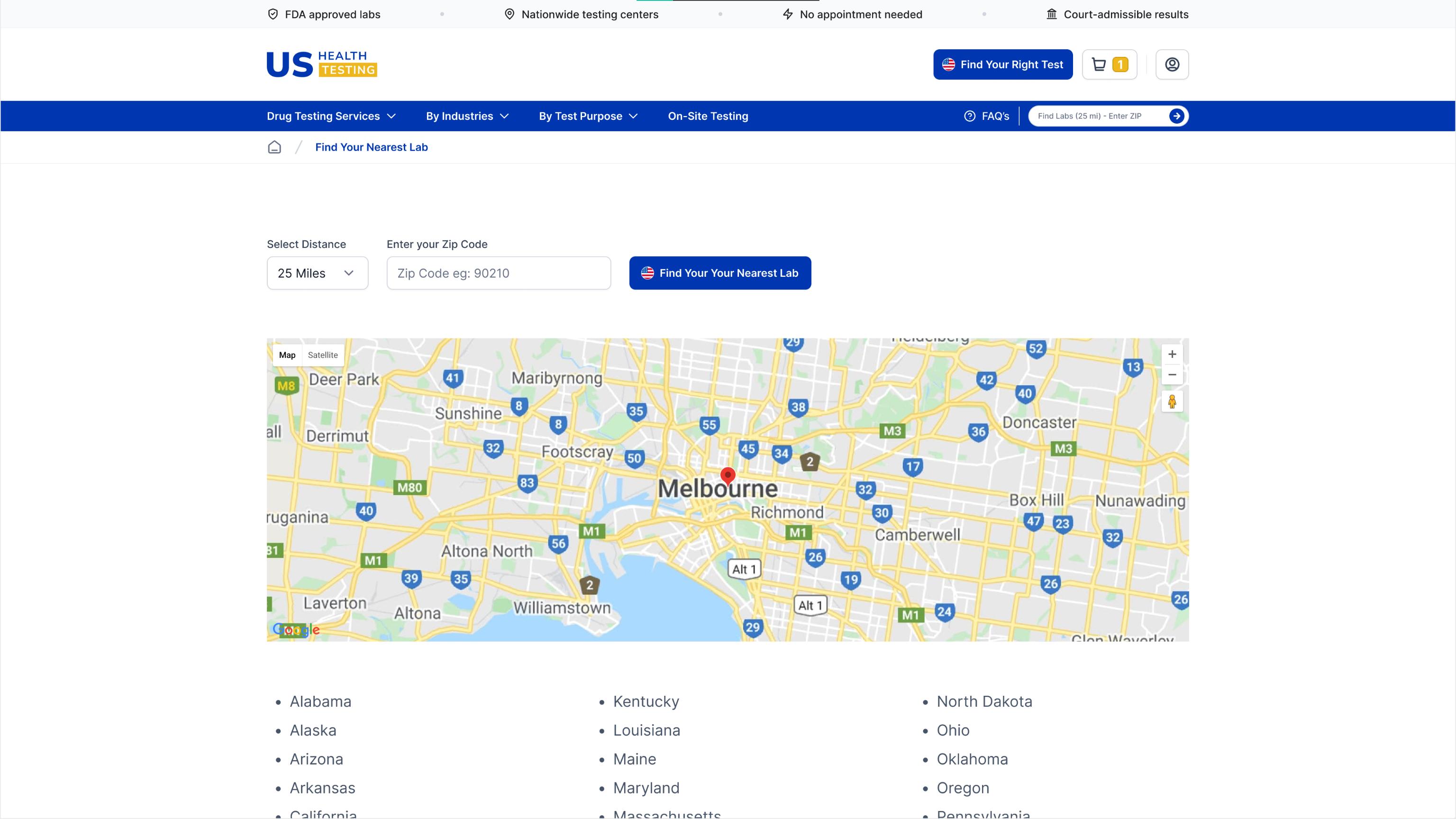
How it works:
- Users enter their zip code to instantly find nearby labs
- Shows distance, operating hours, and availability
- Direct booking integration for seamless appointment scheduling
Testing Result: Validated improvements in location finding efficiency and booking flow completion
6. Comprehensive Test Comparison Table
Created an organized comparison table to help users understand different test types, drug panels, and pricing at a glance.
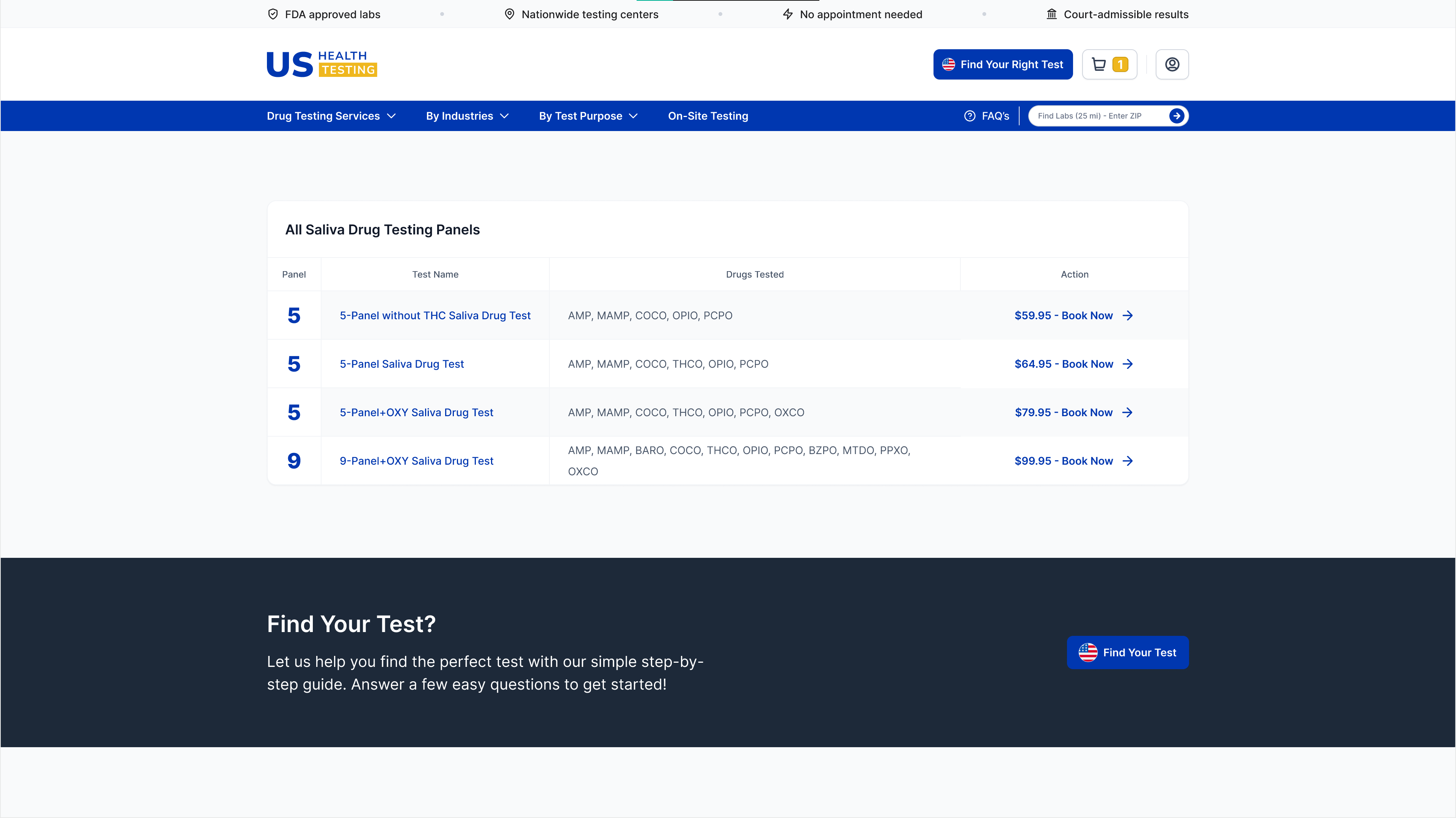
The Problem: Users couldn’t easily compare test types or understand what substances each panel covered
The Solution:
- Clear tabular format showing all available test options
- Side-by-side comparison of drug panels (5-panel, 10-panel, etc.)
- Transparent pricing and substance coverage for each test type
- Easy-to-scan format helping users make informed decisions quickly
Testing Result: Heuristic analysis confirmed significant reduction in decision-making time and increased user confidence in test selection
7. Visual Style & Interaction
Created a calming, trustworthy design system to reduce user anxiety during the booking process.
To instill trust and reduce anxiety:
- Calming blue + neutral palette
- Crisp, modern typography
- Accessible button styles and hierarchy
- Subtle, fast animations for clarity
Validated Design Impact
Based on comprehensive usability testing and heuristic evaluation:
- 30-35% reduction in bounce rate, especially on mobile
- 40% decrease in support inquiries around test selection
- Faster booking completion across all user segments
- Improved user confidence throughout the journey
Design validation confirmed these improvements before development handoff. Client approved for full implementation, calling it “the best work they’ve seen across any of their businesses” and requested ongoing design support for new properties.
Key Learnings
- Simplicity = trust, especially in high-stakes health and legal contexts
- Structured navigation and frictionless checkout directly drive conversion
- Translating medical jargon into plain language reduces user anxiety
Closing Note
This project demonstrates my ability to transform complex healthcare services into simple, human-centered digital platforms.
Looking to simplify your healthcare or testing product? Let’s talk: [email protected]