All Star Cricket 2020 – Mobile Cricket Game UX Design
Project Overview
Client
All Star Games – World’s first multiplayer cricket game
Role
Lead UX Architect, Interaction Designer
Deliverables
Complete UX design, information architecture, user flows, wireframes, UI concepts, interaction design, onboarding experience
Impact
Over 40% D1 retention rate, 25% revenue from IAP, exceptional metrics for domestic market
Design Process Overview
Kickoff
- Stakeholder Interviews
Discovery
- Competitive Analysis
- Qualitative Research
- Quantitative Research
- Persona Construction
Concept & Validation
- Wireframes
- User Interface Concepts
Design
- Information Architecture
- Sitemap
- User Experience Flows
- Final Screens
- Interaction Design
Kickoff
Stakeholder Interviews
I conducted several stakeholder interviews early on during the beginning phase of the project. My goal was to understand the vision of the founders, their current business goals for the product and how they defined success.
Summary: It’s a world’s first multiplayer cricket game, aimed at mid-core mobile gamers from tier 2/3 cities. Available on the Google Play Store. Expected to entertain and engage 1M+ cricket fans all over the world.
Discovery
Competitive Analysis
Based on stakeholder interviews, I began analyzing several competitor products. The goal was to understand the good and bad bits of these products. Performing an audit/review of competing apps is a great way to summarize the competitive landscape.
It brings clarity in differentiating the product’s unique selling point (USP). It also allows us to perform “Heuristic Review” where we document usability flaws and other areas for improvement.
Competitor Apps Analyzed:
- Stick Cricket
- Tennis Clash
- WCC Cricket
- Real Cricket
- Hit Wicket Superstars
Qualitative Research (Attitudinal)
For qualitative research I paired up with our testing team who helped me connect and conducted 1:1 user interviews to get deeper insight into why users were doing things. It allowed me to record their points of frustration and their expectation with regards to the product.
I got a chance to get to know our users in their true sense which is their attitude.
Quantitative Research (Behavioral)
For Quantitative Research, a research method we used for discovery was having an in-depth look at the analytics and generate funnel and segment charts for continuous monitoring.
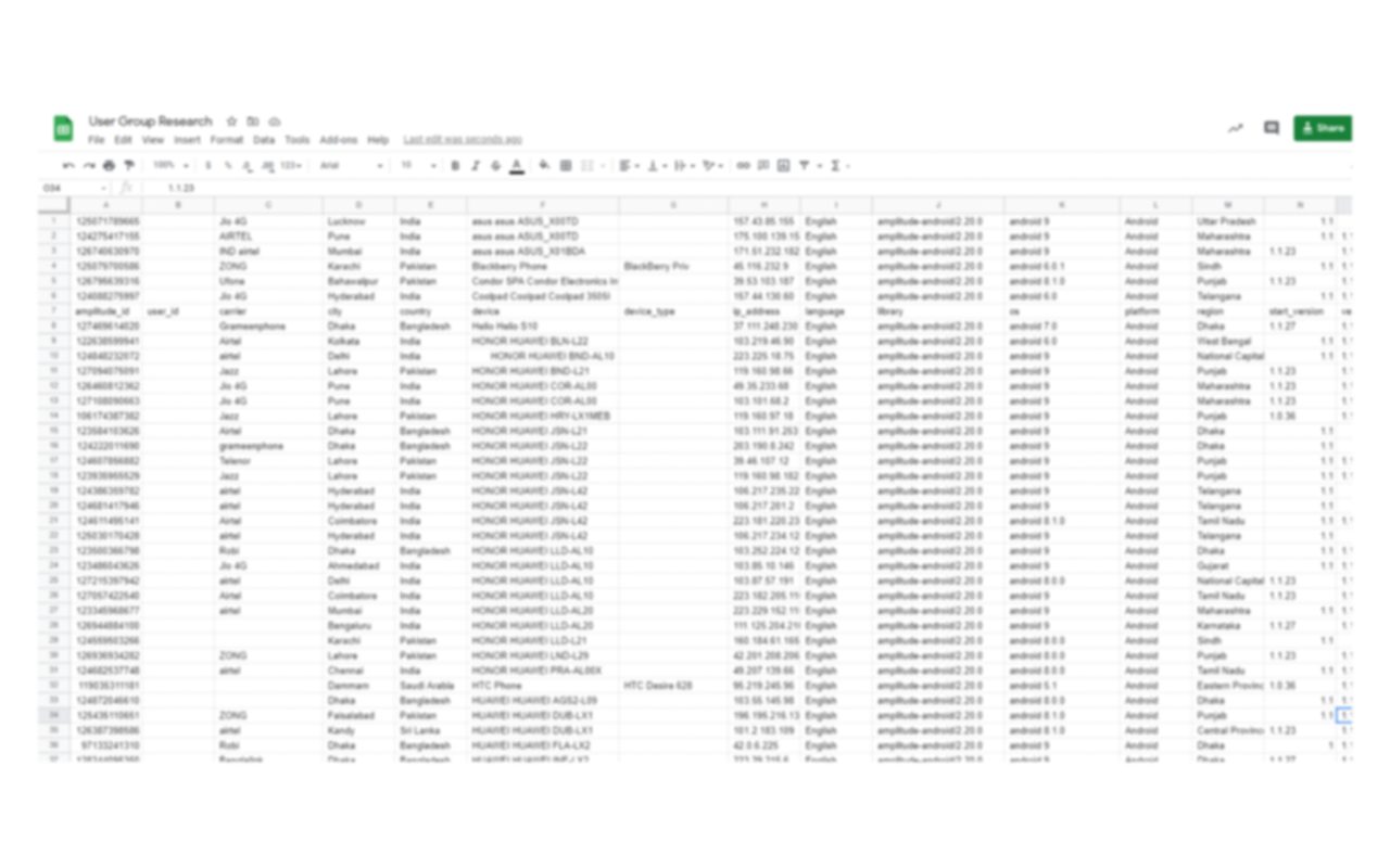
We used quantitative data to inform the user persona.
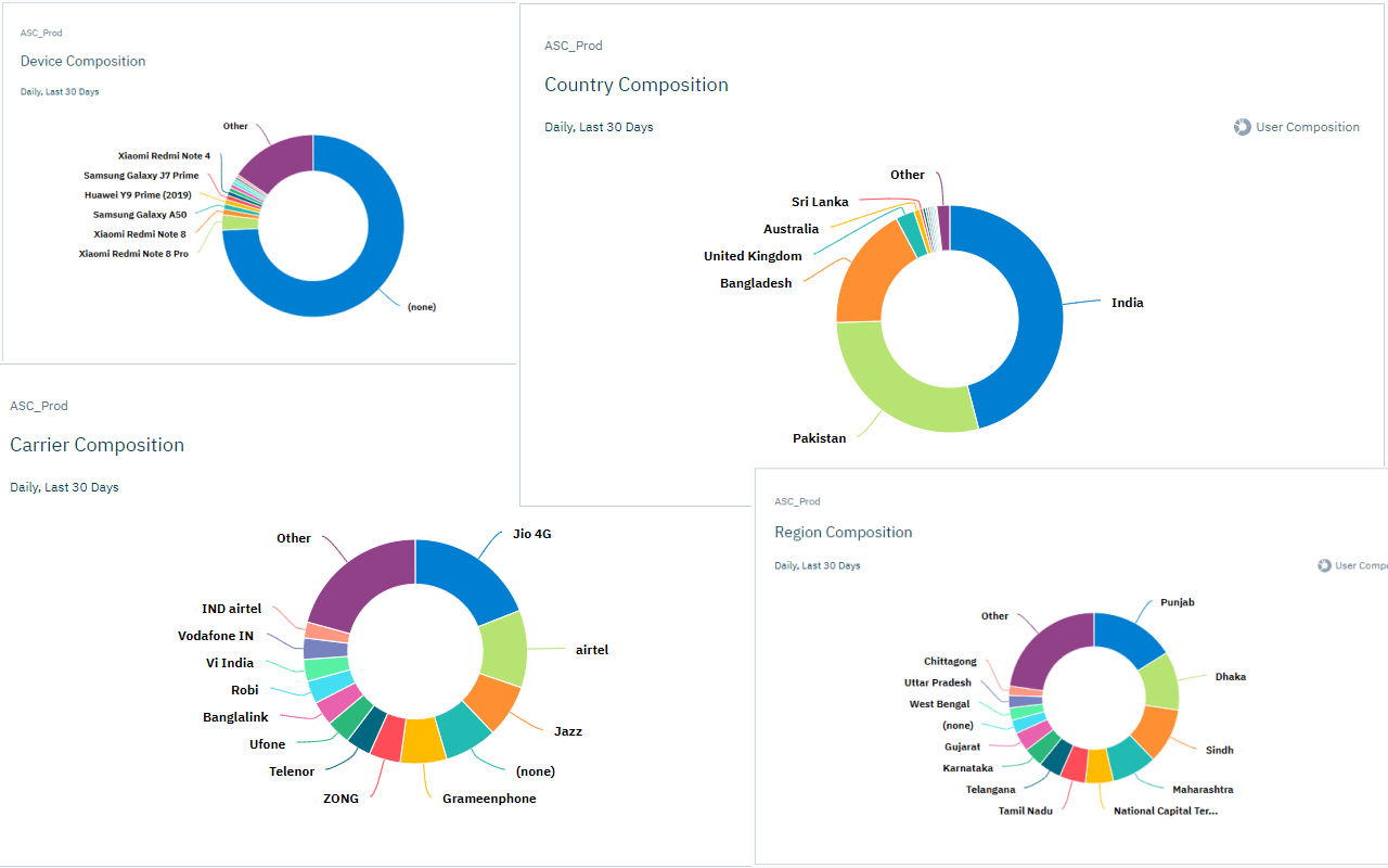
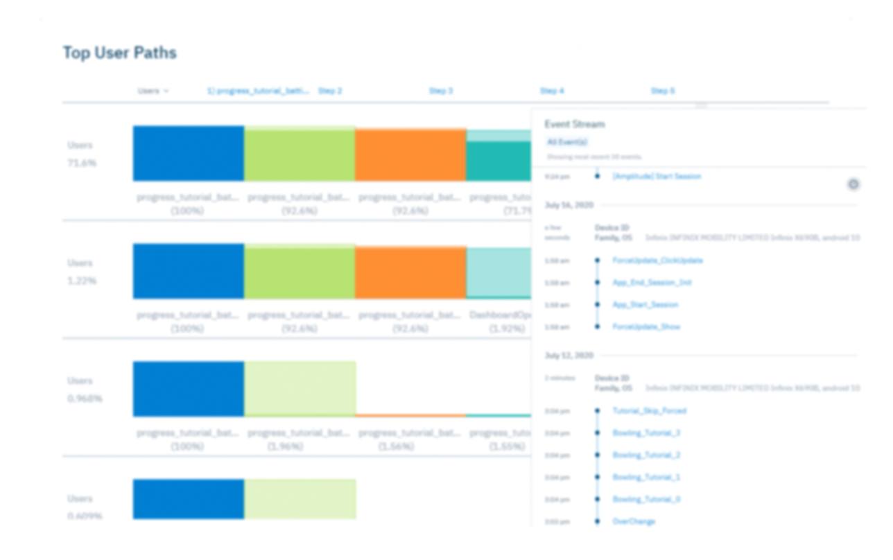
User behavior analysis and data visualization
Persona Construction
We used quantitative and qualitative methods of user research to inform the user persona construction.
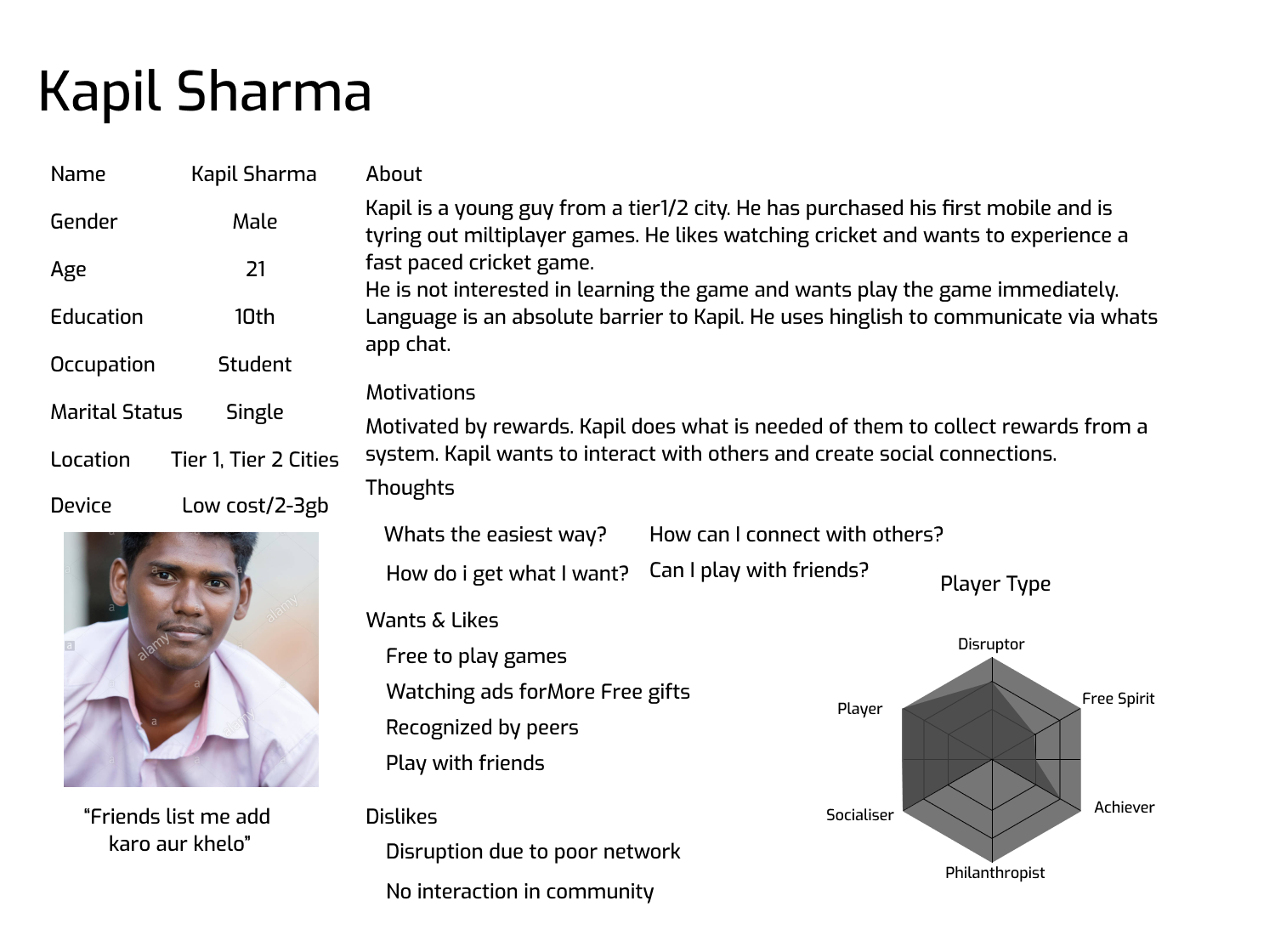
Primary Persona
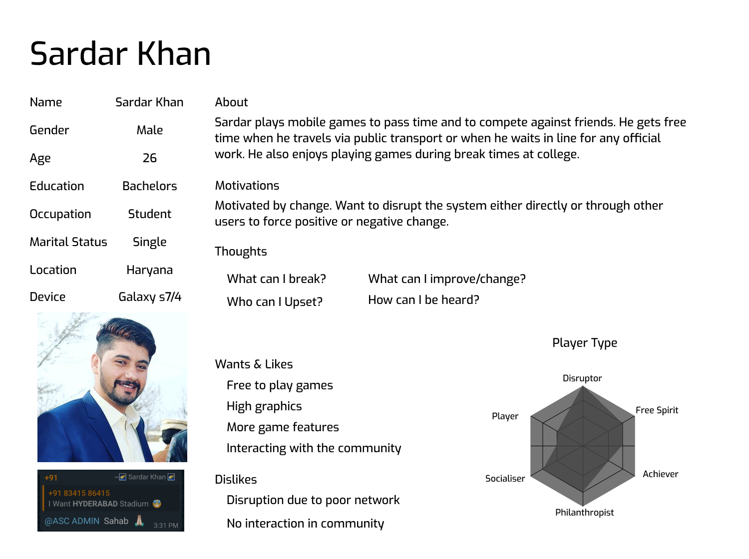
Secondary Persona
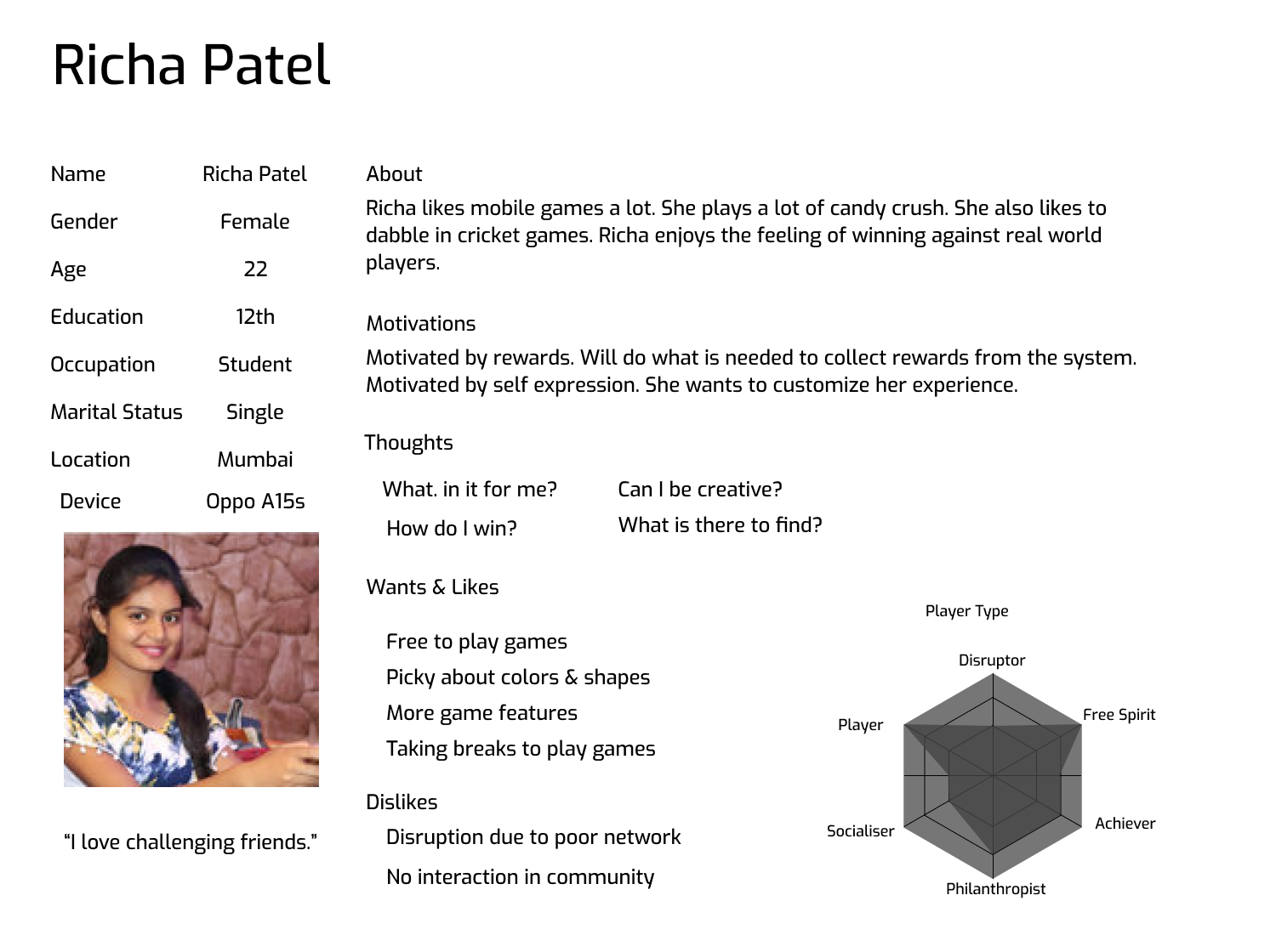
Tertiary Persona
Concepts & Validation
After multiple iterations the final wireframes were presented to the stakeholders. It allowed them to envision what the final product might look like and how the information was organized.
Wireframes

Design
Information Architecture

Sitemap

UX Flows
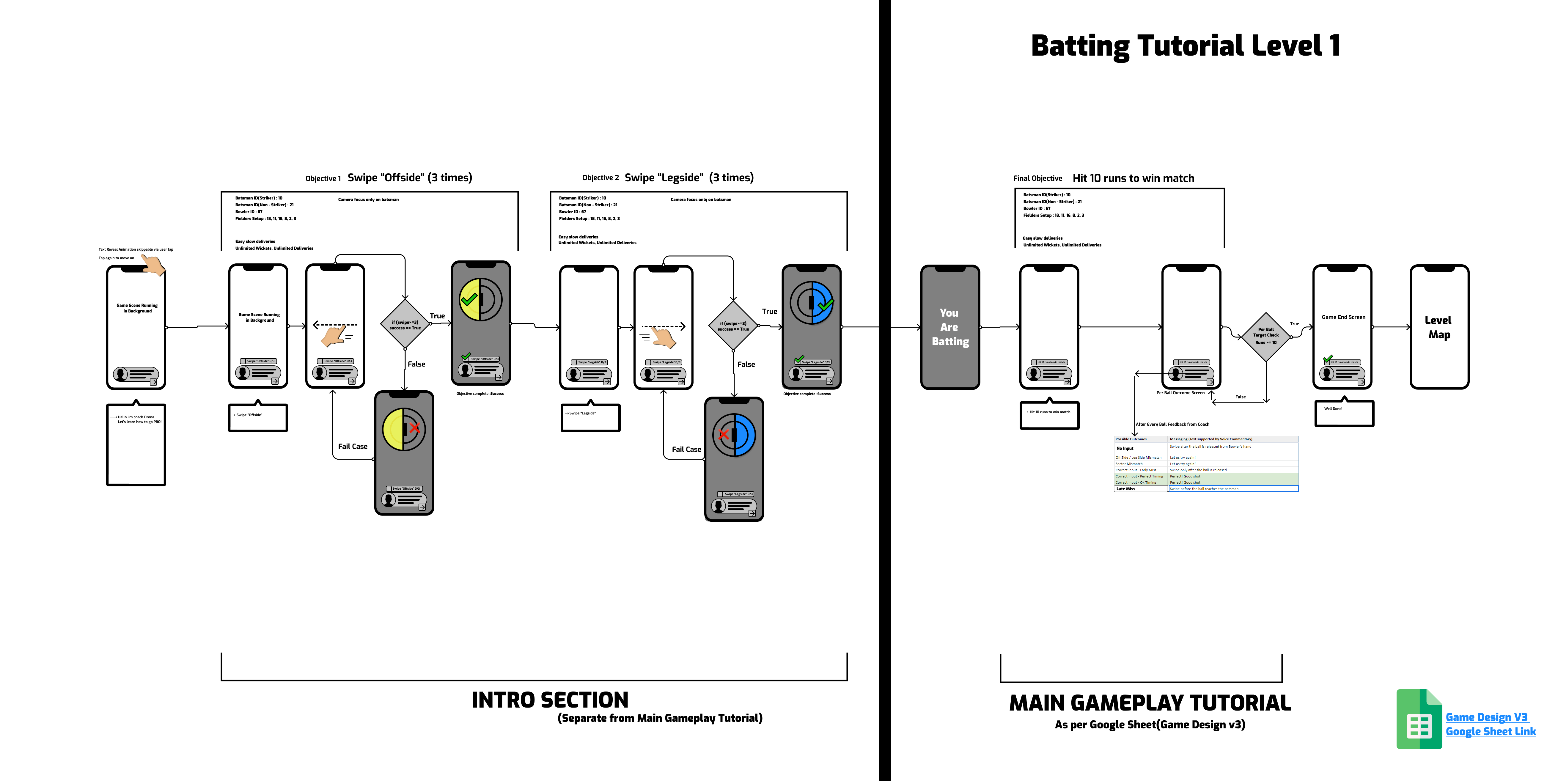
Tutorial Flow (Sample)
Core Loop
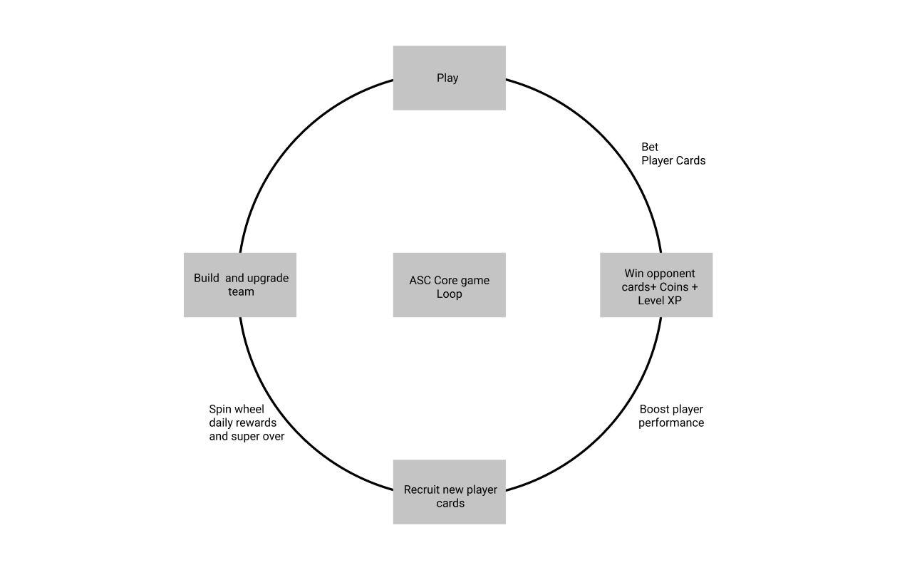
Core loop is a chain of actions that are repeated over and over as the primary flow your players experience.
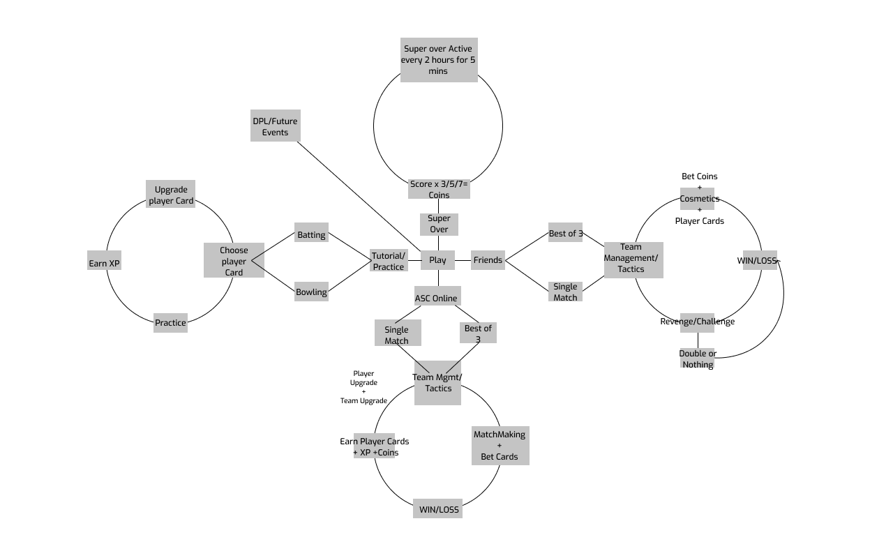
Game Design Loop
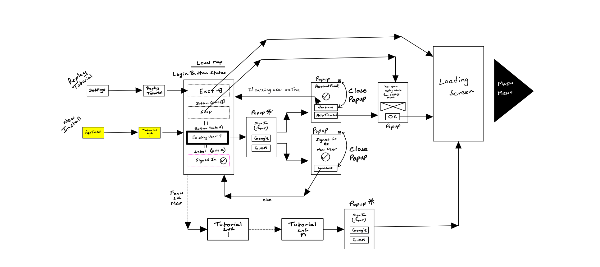
FTUE & Onboarding
Learning Types: Our user research indicated we had 2 types of learners:
- Exploitative Acquisition - Learners who learn by taking risks. They push every button and flip every lever.
- Modeling Acquisition - Learners who want to know how something works before they try it.
Sentences requiring higher language grasp (eg. “Anticipate the ball”) wouldn’t work, hence we designed a tutorial where things taught were visual and supported both types of learners, thus breaking the language barrier.
Being gamer user types, the impatience was quite high. Hence, we decided to go with a narrative design where we were able to handhold the users longer without causing them frustration. The narrative elements helped provide greater immersion, which was crucial for engage-ability.
Button States
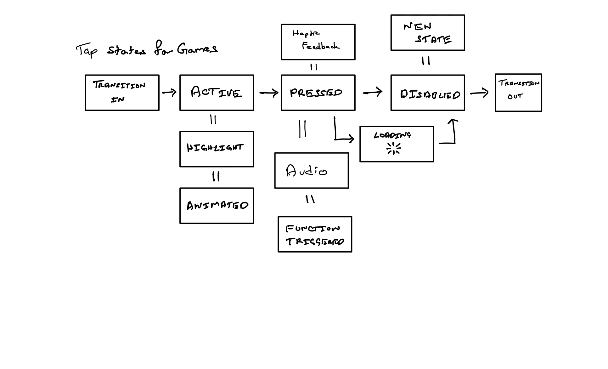
Button states design was important as a good part of UX can be delivered through the most common interaction i.e tapping the button.
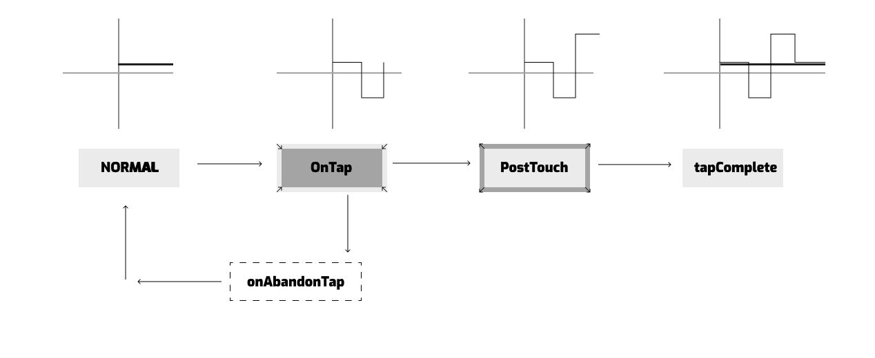
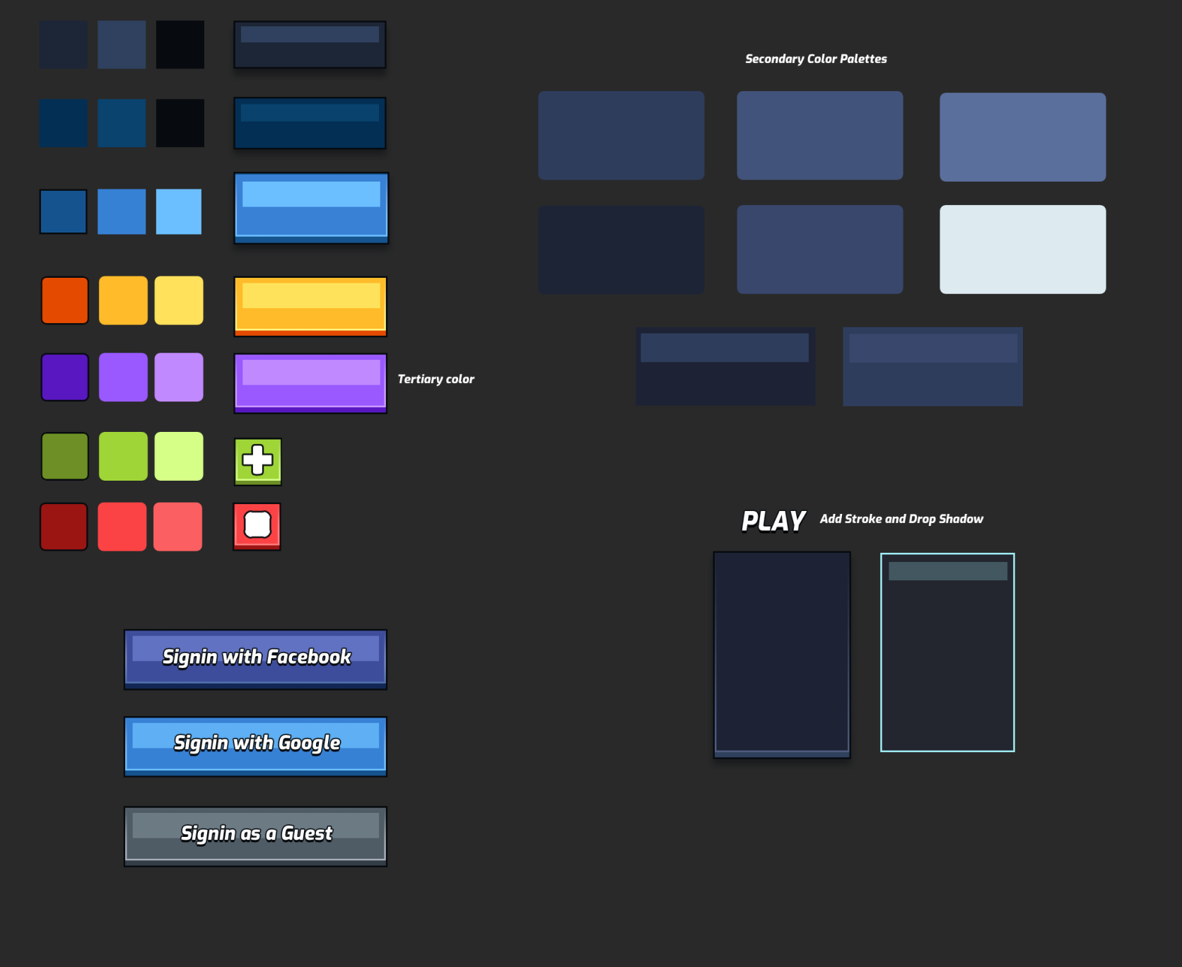
We also had to define the button animation states that was experienced by the user as he/she traverses through the UI. This is important as the button tap depth and shadow and other visual elements which are part of the fully functional button, needs to feel like its a part of the game world. This promotes better immersion and leads to higher engage-ability.
On-Boarding
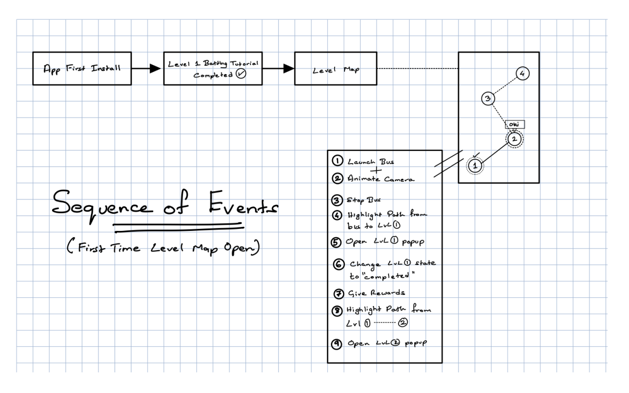
The sequence of events for a FTUE had to be communicated to the game programmers. Above image describes a basic cinematic experience which was designed and implemented.
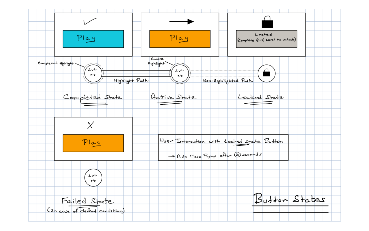
The interaction and its states for the level map in which we had to describe the button states as well as environment changes such as path highlight and flag deploy (to signal completion of a level).
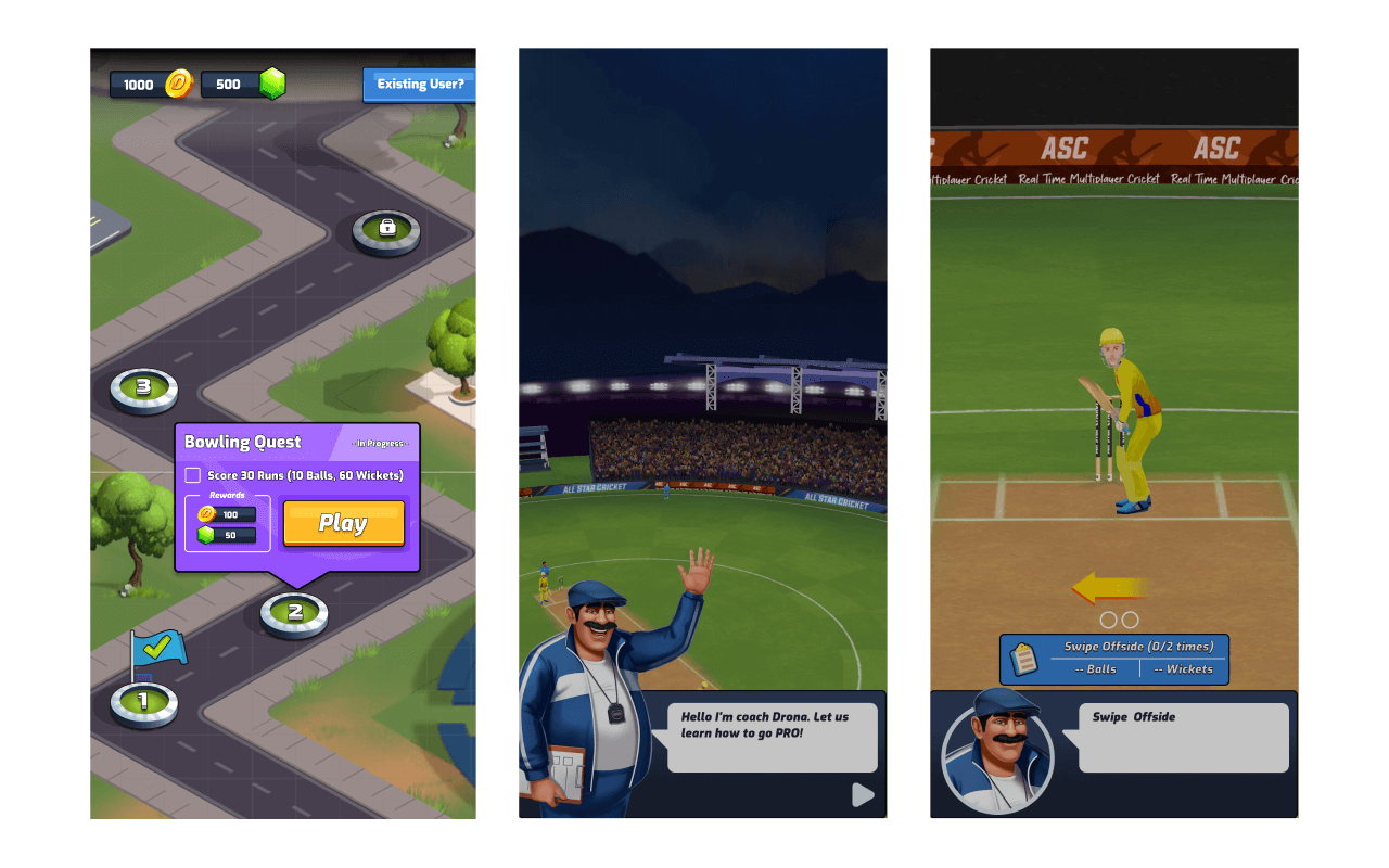
Some example screens of narrative driven user onboarding. We used a concept “Modeling Acquisition by animated objects” where an isolated finger guided the user on the exact interaction input the system was waiting to receive.
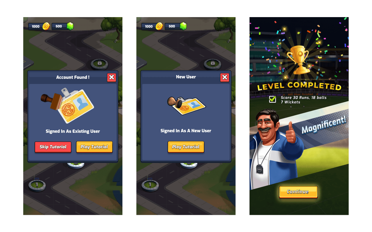
We ensured that tutorial was designed keeping in mind both existing as well as new users. Existing users were able to skip the tutorial while the new users had to go through the tutorial at least once in their game lifetime.
We ensured that the effort of learning our game system was rewarded by having a very glorified tutorial end screen that properly acknowledged the users success in completing objective.
Color Palette and Button Styles
Final Screens


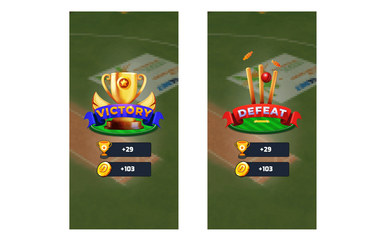
Game Over Screens
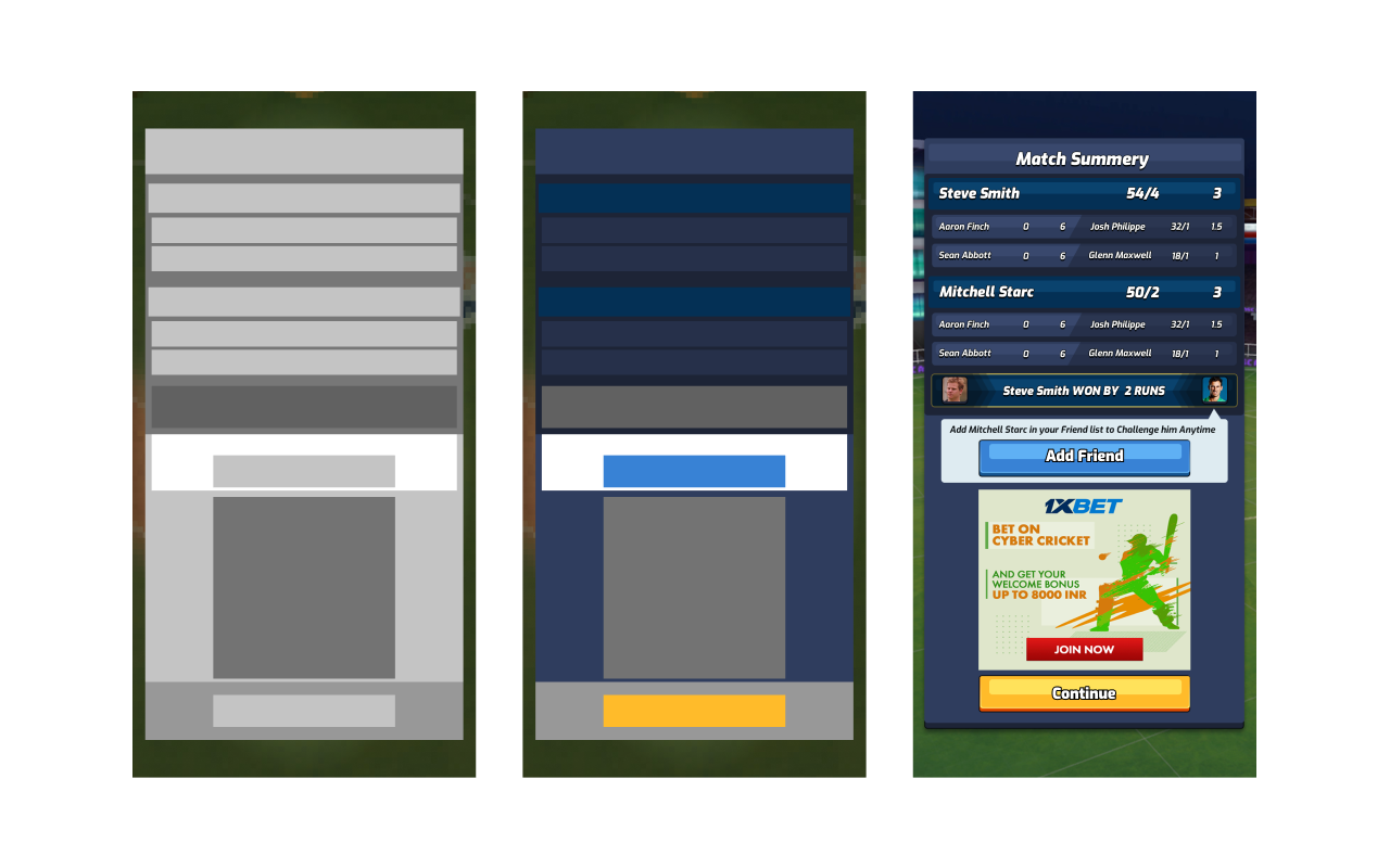
UI Depth: We wanted the UI depth to not go more than one level in most cases. And we made sure popups were not full screen because:
- People get easily confused when going through multiple windows. They forget how to get back, they lose track and interface can overwhelm them.
- It’s important to create an interface that user expects and knows how to interact with. Showing a popup and not full screen window helps the user to orient himself. He can see previous UI behind popup window.
One hand interface had a huge impact for our users as it allowed players to play the game in more situations and places. And that helped to improve retention in the product.
Stadiums
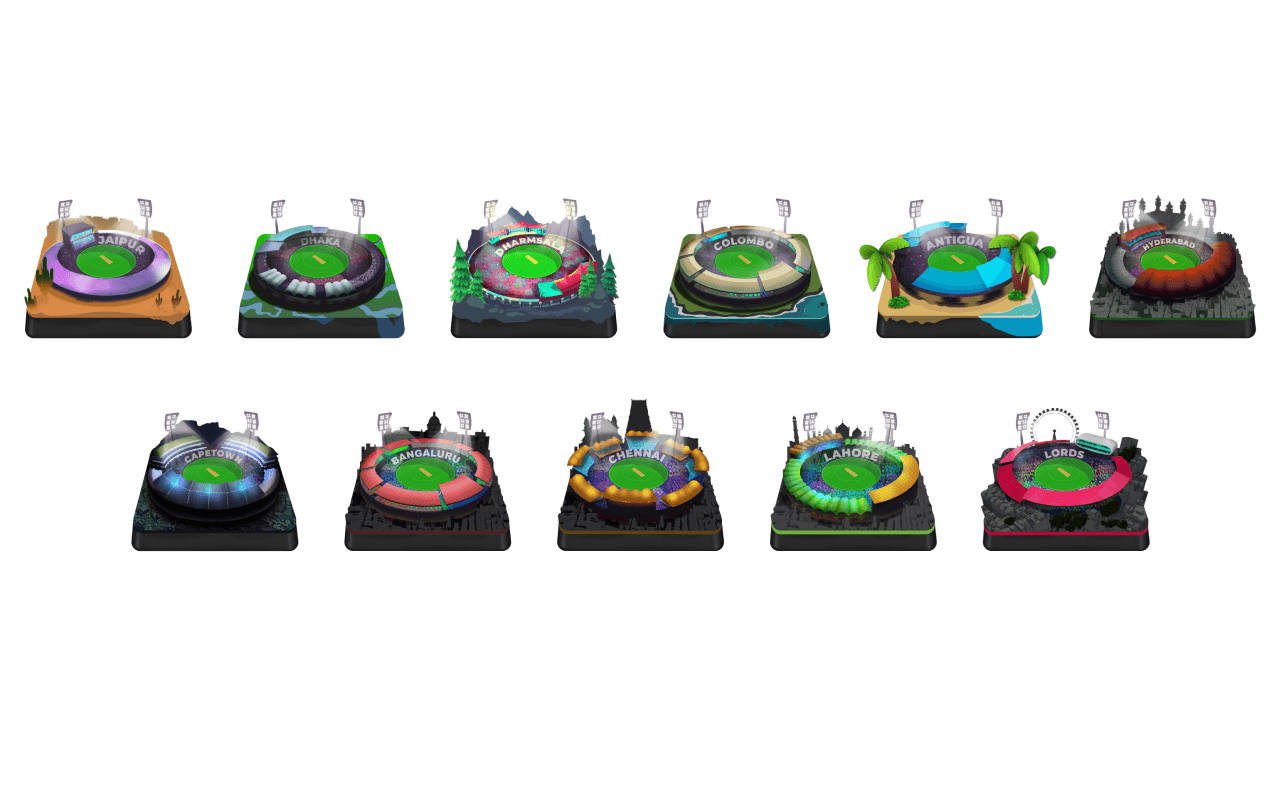
I was instrumental in concept ideation and worked closely with artists to get them to bring the ideas to life. We planned the visual system such that there was visual hierarchy among badges of the same series.
Badges
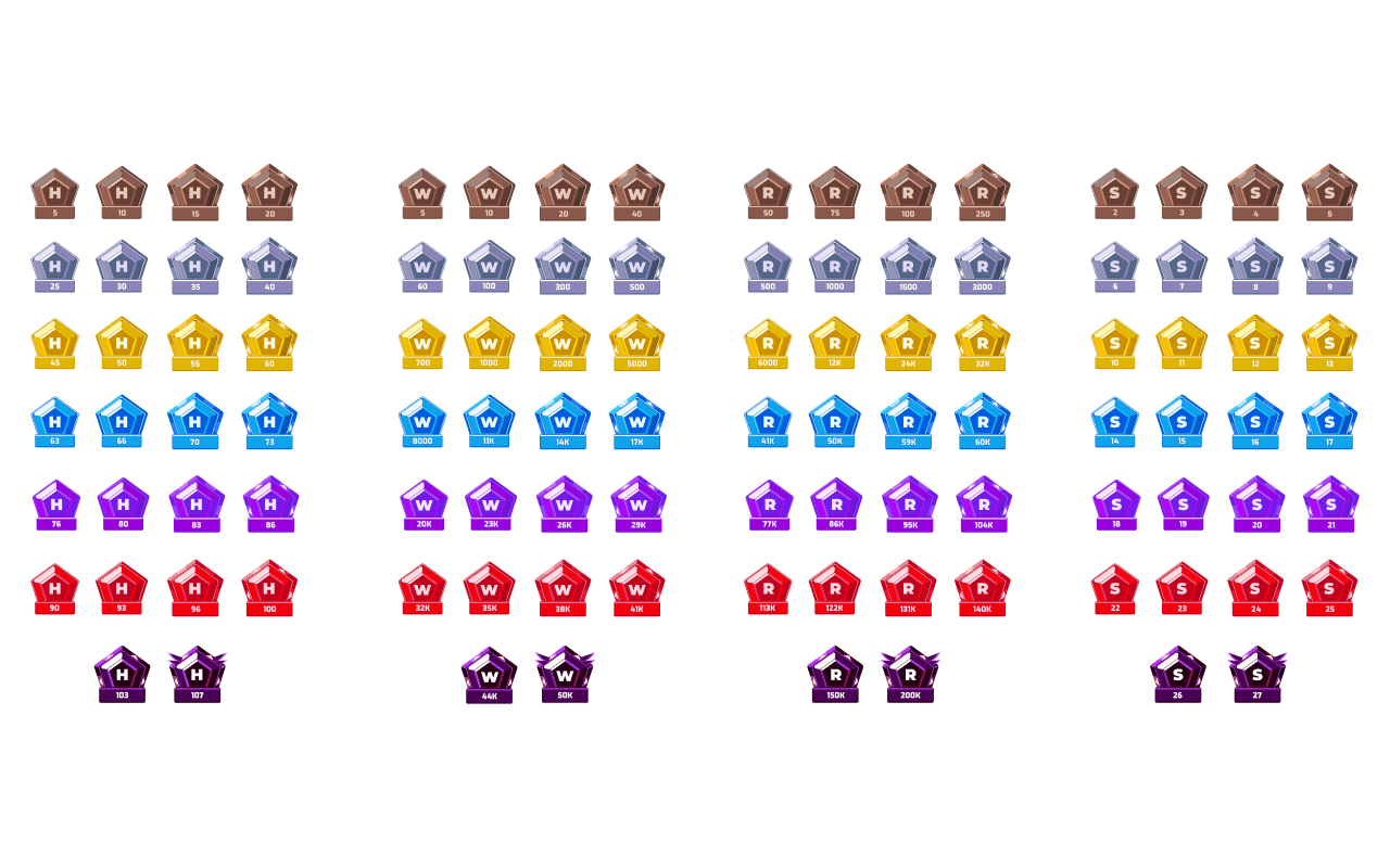
We created a badge system that rewarded badges to users who were able to achieve streaks/records. This gave users incentive to be more invested in the game.
Interaction Design
A few screens that showcase interaction design.
Outcomes
40%+
D1 Retention Rate
25%
Revenue from IAP
1M+
Cricket Fans Engaged
All Star Cricket already has over +40% D1 retention rate in MVP, and 25% of revenue is coming from IAP, exceptional metrics for a title aimed at the domestic market.
Our Team
